About Me

My photo
Costume and Performance Design Arts University College Bournemouth

Tuesday, 14 June 2011

Final Evaluation

After reading back at my Learning agreement I feel I have achieved all of the points raised. I believe I have successfully interpreted the play into a visually pleasing production. My costume designs have been well researched and developed, taking character analysis and hierarchy into consideration when starting to design. I also considered my set when I was designing, looking at how the costume and set compliment each other careful not to create too much fuss for what I wanted to be quite a symbolic set.

The Top Girls production is the earliest of the three being performed by the Arts University’s students in the autumn term, therefore not allowing enough time to make the costumes. As a result of this the costumes had to be sourced, and this process will continue up until performance time due to the time consuming method behind acquiring contacts and searching for items that match my design image. I managed to source a good deal of 1980’s clothing through websites. This can now be expanded by looking in charity shops.

I successfully designed a set, able to change to each scene quickly and look effective.  The table that can be adapted by splitting in three and stacked in different ways supplies a clever scene change that is interesting to watch for the audience. My set is simple; it compliments the costumes well, by aiding them with lighting and few props rather then a busy set that hides the costumes. My set box effectively displays the amount of space used for both audience and actors.

This project has helped me better understand the roles within theatre, and this will only improve further on the completion of the production, after I have witnesses it realised onto the stage. The project has tested me in areas I have not been familiar with such as the sourcing aspect. I have grown in confidence and will continue to do so after the future meetings that take place. I will have to talk through my designs confidently to the Director herself and the Lighting designer/ technical manager in the way I have done in my tutorials. Discussing my approach towards the characters to the actors who will play them was very useful as the two ideas have to match in order to work on stage. Accumulating other’s ideas and approaches to the script opened my eyes to diverse meanings and concepts I hadn’t thought of. Ideally I would have had more meetings with the cast and met with the production team to gather thoughts so we were on the same wave length in terms of design and concept ideas behind the play. However I am excited for the future collaborations when approaching the production and realising the play.
This project improved upon my time management skills; completing aspects of work for certain dates and meetings allowed me to prioritise and set myself goals to achieve throughout the project. This project also reminded me of the limitations of the theatre space I’m using in regards to set, but didn’t hinder my designs.

I feel I have communicated my research, inspirations, and designs effectively through both my sketchbook and blog, explaining clearly the thought processes behind my developments, final designs and outcomes. I feel my costume designs communicate effectively the fabric choices through the look, drape and colour. At times I found it quite difficult to create the correct colour as I used watercolour pencils and when water is added they tend to change tone. However the pictures of the costumes that I sourced put on the final designs supports the drawn image.
I am happy with my final designs and feel the costumes compliment each other well fulfilling their purpose and effect; Angie’s costume allows the audience to understand she is young and makes her stand out when in the office scene, somewhere she does not fit in. All the costumes work well together, the colours are taken from the ‘Dulle Griet’ painting so is proven to look good together. Originally I wanted a divide in the status of each character through the colour of their costumes; the darker colours from the painting would reflect the lower status characters and the lighter more optimistic colours, the higher status characters. This idea was made harder through the sourcing method as I could sometimes find an item that would fit the character in shape and style but not in colour. Nevertheless this could be addressed by dying the fabric or rendering it to adapt the shape.

To conclude this project I feel I have successfully addressed missing aspects of my portfolio by involving myself in an actual production as apposed to theoretical productions in previous projects. I have improved greatly on my time management and confidence throughout this project and am excited for future organisation for the production and to see it live on stage.

Sunday, 12 June 2011

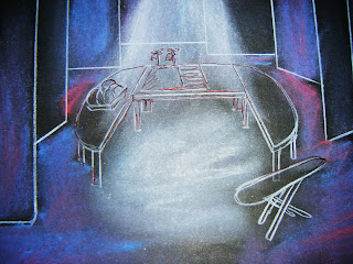
Set Box

My Set Box

This is the Restaurant Scene


The tables are pushed together with a white table cloth over 


The wings are quite close in to create a compact area.


The Office Scene


The tables are separated into the office layout.


The wings are pushed to the sides as much as possible to create more space.

The Garden Scene


Two of the tables are stacked together to create the den.


The remaining table is placed up on its edge as the back door.


The Kitchen Scene

The tables are pushed together in a U-shape to create the kitchen surface.


Through doing a rough white card model of the set it is visually communicative as to how the set is adaptable. I can use this model to test lighting ideas using a torch and coloured sheets. 
The set box will have to be made in detail and neater than this in level 6 so that it can be translated exactly into the studio theatre space. 
The idea of having white backdrops and wings that can be moved makes the stage bright to look at which is where this design relies on coloured lighting to soften the harshness of the white.

Saturday, 11 June 2011

Set Development

From starting my set design with a staple table I have expanded it, adding symbolic lighting to create a tone and mood to each scene.
I took inspiration from watching 'Exit Stage Left' the use of coloured lighting setting the scene.
I have decided to use lighting not only to set the scene in the case of the garden with green lighting, but to use colours that have relevant meanings; The restaurant scene uses red, being a warm tone to represent candle light but also symbolising energy, war, strength, power and 
desire; emotions all the characters in this scene face.
Next the office scene uses blue lights symbolising wisdom, confidence and intelligence, all traits the Top Girls fulfil. The blue colour could also represent tension between Mrs Kidd and Marlene, and Nell and Marlene.
The garden scene lit in green not only sets the scene for outdoors and nature but symbolises growth and a strong emotional correspondence with safety, which is reflected in the safety of the den.
Finally the kitchen scene is lit in a dark purple light to symbolise gloom, sad feelings and frustration evident between Marlene and Joyce.


I feel the use of lighting and simple set makes scene changes quick and flowing, yet clear to the audience where and what is going on.
I designed the wings to be white so they can show the colours well. I also decided to make them moveable so the actors can spin them round to show a scene is changing, the movement of the wings, backdrop and set will create a sort of whirl wind effect between scenes almost like a routine, like in the first act.

Friday, 10 June 2011

Exit Stage Left

"‘Exit Stage Left’ is a unique contemporary theatre piece which involves the work of our graduating School of Performance students. Incorporating excerpts from this academic year’s productions (including Ship of Fools and Coyote was Going There) as well as newly devised material, this is a bold and innovative extravaganza offering the audience an experience unlike any other.

Performed at Pavilion Dance in the heart of Bournemouth’s art-deco Pavilion Theatre, ‘Exit Stage Left’ marks the culmination of three years of study for our School of Performance students and signifies the start of their journey into the professional arena. Over 150 students will take part in this production from all three courses. This collaboration between the courses emulates the way in which the creative industries work together, and lets the students experience the thrill of a live production. It is just one example of how the University Colleges specialist courses work together to realise innovative ideas that help prepare students for careers in the creative industries."

                                   
 Exit Stage Left inspired much of my initial set design. The set and props created a showcase/ rehearsal type environment; with see- through wings and backdrop the audience could see backstage at the control and prompt desks. When entering the environment the clothes rails were on stage and then cleared for the actors to warm up. Instructions were shouted out to the lighting team and acts were introduced informally by the actors. 
The set was easily adaptable, remaining the same but with props to aid the scenes. The lighting played a key part in setting the tone for the scene, with coloured lighting to reflect each mood. The simple see- though plastic sheets picked up the colours well as did the plain white background behind.
I took from this the effectiveness of lighting and how best to adapt a scene quickly and effectively with a symbolic outcome. I wanted my set to be simple, to support the costumes not over power them, and to achieve an easily changeable set.
The props were reused for different purposes and moved about the stage swiftly and as part of the act. I have picked up on this idea with my table design; by splitting it into three pieces it can fulfil it role as a restaurant table, office desks, a den and a kitchen. 

Thursday, 9 June 2011

Final Costume Designs

Below are my final designs for the characters in Top Girls;

Marlene


I am pleased with my design for Marlene, it shows her powerful position by capturing the inspiration of Margaret Thatcher. The style of her suit is very much on trend, I felt she would have treated herself to a new suit for her promotion. I am still to source a blazer jacket, but have successfully found an ideal blouse and skirt. Both were from online vintage stores.

Joyce


Joyce's costume reflects the working life she leads; holding down four cleaning jobs I thought by wearing an 80's summer dress that is smart and with an apron it displays the correct image to the audience. She wears slippers as in each scene she is home and has probably already had a hard day at work. This costume is suitable for all Joyce's scenes as she would not worry bout new clothes. This outfit is her uniform and has been for some time, it has a function and is not desirable.   

Angie


Angie is a teenager who is autistic. I felt a child like outfit would be dungarees. The dungarees may communicate to a modern audience this childlike character, but also at the time this style was very much in fashion. A huge inspiration was the early 80s band Dexys Midnight Runners. Like any teenager today Angie would have chased the fashions of the time and idolise her favourite band while her image reflects this. The dress that Marlene gives her is pretty and fashionable. I feel Marlene would attempt to make her look more grown up and lady like, so maybe very different to her usual style, but she loves it because Marlene gave it to her.

Kit

The script describes Kit in a dress. I pictured her being slightly more girlie in image than Angie, but in the similar laid back style Angie would be wearing as Kit idolises her. The main similarities between the costumes being the converse trainers and denim. This denim jacket and dress are also fashionable at the time as I feel Kit would want to impress Angie.


Win                                                                                                                                       Nell
Win is the slightly gentler character, so I decided to place her in a suit jacket and chinos, creating a softer silhouette. The costume is very on trend in the early 80s, the inspiration taken from the August 1979 addition of Vogue.
Nell is the 'next Marlene' so I decided to dress her in a similar way, keeping the blue colour scheme in the check of her suit. The edges and silhouette of her clothing is sharper than Wins to reflect her sharp character. 

Louise                                                                                                                               Shona
Louise thinks of herself as a man, so in doing so wouldn't dress in a feminine way. I decided to put her in flat shoes a suit jacket and trousers to so practicality not style.
 Shona is the young character with no experience, I decided to design a dress for her that would be her attempt at looking older. 


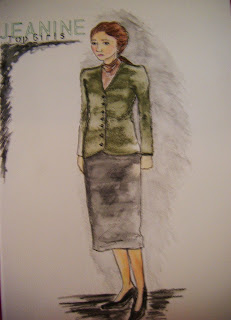
 Jeanine
Jeanine is the traditional woman who wants to get married, I designed her in quite pain clothing to reflect the way the 'Top Girs' see her. They see getting married as a weakness, and quite old fashioned. 

Waitress                                                                                                                                     Mrs Kidd
 The Waitress is wearing a plain and traditional dress and apron, she blends into the background easily when she is ignored by the 'Top Girls'.
Mrs Kidd is the traditional woman, the dutiful wife. I designed her in this woollen red dress, which appears quite frumpy, reflecting her old values and the toll her husbands anger has had on her, yet is fashionable so as to keep her reputation clear.  

 Pope Joan

Pope Joan is seen in all her regalia. I designed a lighter costume to allow more movement for the physical scene. The colours used reflect the almost royal and pure tones the Pope should represent.
Isabella Bird

For Isabella I looked into travellers fashions of the 19th century. My main inspiration came from the film 'The Piano'; believing Isabella Bird to look like the character Aga. The costume is practical in comparison to others of the time, it hs no real fuss about it very much like her character.

Dull Gret

Dull Gret is exactly how you see her in the painting; dressed in armour and an apron carrying a sword and a basket.


Lady Nijo

I designed Lady Nijo's costume to look like the 8 layered gown she talks of incorporating the fine silks she boasts about. The bright colours used reflect her flamboyant nature and love for clothes.


Patient Griselda 

For this design I looked at existing painting of Griselda and took inspiration from them. I used colours that appear in the painting and represent a very medieval look.

Wednesday, 8 June 2011

Reflecting on Costume Sourcing

Sourcing costumes was a new territory for me. From previously being used to sourcing fabrics; picking and choosing what trimmings and styles to have, it is very different to find whole garments that match your designs.
I was lucky in finding certain items such as the dungarees and top which matched the exact look I was aiming for with Angie. 
I feel I need a greater understanding into the sourcing field, and as my project and the sourcing of costume and set continues over the summer I hope to learn a lot more. I have struggled with the period costumes and where to hire them from, what contacts I need and how to get them. This is the part of the project that I need most guidance in.
I have learnt from this process that more communication between myself and the director is needed so that buying can start as soon as possible so as to avoid items being sold out. I feel I also need to talk more to the tutors to find out possible contacts and gather advise on this area as I search for the costumes.
I have also learnt that contacts through friendship groups are very important, knowing someone who has been through the sourcing process is useful and can keep costs down by borrowing existing items they already have; such as a possible Kimono that might suit my character Lady Nijo.
It is clear that to be successful in this job, contacts are crucial in securing inexpensive finds and buys.

Sourcing Costumes and Set

My designs require sourcing as there is limited time to make them. To begin this process I trawled  the internet looking for online Vintage stores that would supply my desired costumes.

I had a very specific look I wanted for the character Marlene; capturing the blue and powerful status clothing that Margaret Thatcher exudes. I looked at the site;


On this site I found numerous buys that matched my designs. For Marlene I found a sheer lilac blouse with drop ruffle detailing on the neckline and with slight red and blue stripes. I also found a blue skirt ideal for my design, this skirt was from;


1980s Ladies Vintage Blue Jacques Vert Kickflare Pencil Skirt Size 10


Back on rokit.co.uk I found a functional looking dress for Joyce. It is a sky blue and white striped 80s day dress with a v-neck, waistbelt and pockets.


 To match this and complete the look I found a bib apron from the website;


AD207 Bib Apron

For Angie I found the perfect pair of classic navy blue denim dungarees with contrasting white stitching by Ikeda. They are the exact style from my inspirational research into Dexys Midnight Runners. I found them again on rokit.co.uk


To complete the Dexys Midnight Runners look I sourced this vintage 80's Ladies Harley Davidson Sleeveless Top, which I thought matched the casual laid back look Angie incorporates.


i then looked back on rokit for Angie's dress that Marlene gives her, looking ideally for a girlie dress, completely different to the style she normally wears, but loves because of Marlene giving it to her. I found this pink, blue, green and white floral print dress. 

Again on rokit I found a dress and denim jacket for Kit in a similar style to that of Angie. The dress is a bold aztec print 80s sun dress in purple, magenta, green and black and the denim jacket is in acid wash indigo denim, with embroidered pink and white design on the yoke;


Next for Mrs Kidd I sourced a 1980s red long sleeved knitted dress with diagonal buttons across the front, again from rokit.


For the Waitress I found uniform again from Internet-workwear.co.uk. I found an appropriate black dress with contrasting white collar and trim on the sleeves, as well as a half apron with a broderie Anglaise trim.

AD132 Traditional half apronAD160 Classic Dress


Next for Win I sourced a a bright red 80s boxy jacket, brown chino style tailored trousers and a long sleeved off-white blouse, all from rokit.


The last costume I've managed to source at this stage is for Shona. I found a 1980s Lady Carol Pleated Shirtwaister dress with a blue grey and rust watercolour print. I found this on Myvintage.co.uk

Ladies Vintage 1980s Lady Carol Pleated Shirtwaister Dress Size 14


For the set design I have sourced tables that may do for the split table idea, but I have to look again at sizes due to fitting 6 people around them in the first scene. I want to look as well for tables similar but maybe with wheels to make swift scene changes flowing even more.


I am continuing to search and source costumes and set for this project up to and past my deadline. This is a time consuming part of the project from which I have learnt alot. I find this the most challenging part as it is something I have not done before, sourcing the 80s clothing is somewhat easier due to there being vintage shops on line and easily accessible on high streets through the form of boutiques and charity shops, it is with the period costumes that I am struggling, I need to acquire contacts through costume hire departments and stores................